


The Problem
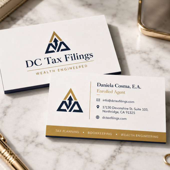
When DC Tax Filings came to BW Elevate, the visual identity was holding the business back in ways that weren’t always obvious day to day, but showed up every time a client needed to be reassured before handing over sensitive financial documents.
The starting point:
- An outdated logo with no clear rationale behind its design, colors, or typography
- No brand guidelines — meaning every new asset (a flyer, a social post, an email signature) was designed from scratch, inconsistently, often by different people or tools
- No visual consistency across whatever touchpoints did exist, which made the business look smaller and less established than it actually was
- A trust gap by design — tax preparation is a category where clients are handing over SSNs, income statements, and financial history. A dated or inconsistent brand doesn’t just look unpolished; it quietly raises doubt at the exact moment a client needs confidence
Daniela’s business was solid. Her brand wasn’t communicating that.
The Approach
Rather than treating this as a cosmetic logo refresh, we approached it as a trust-building exercise first and a design exercise second. Every decision — color, type, mark — was made to answer one question: does this make a client feel safe handing over their financial information?
Audit and discovery
Reviewing every existing touchpoint (however minimal) to understand what, if anything, was worth preserving, and interviewing Daniela on how she wanted to be perceived versus how she was currently coming across
Positioning before pixels
Defining what DC Tax Filings needed to say visually (precision, reliability, approachability) before opening Illustrator
Logo redesign
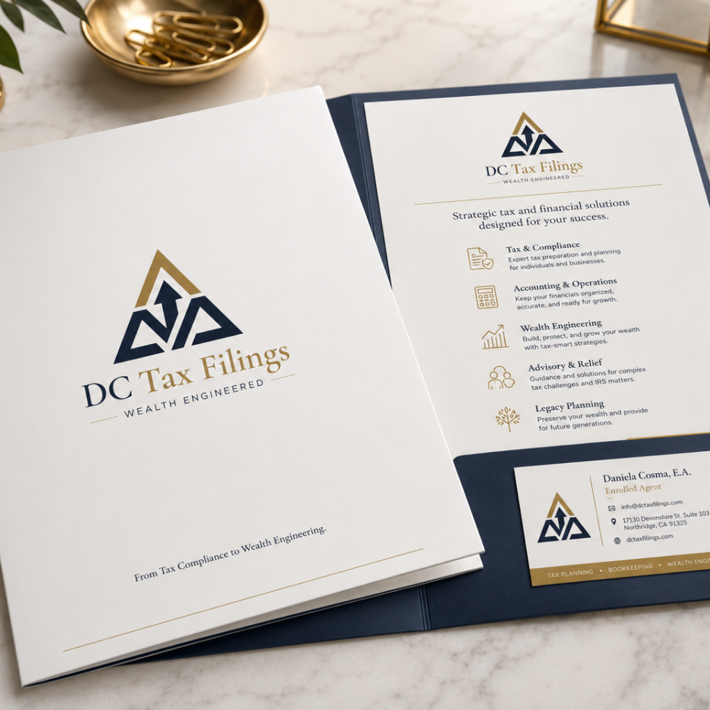
A clean, modern mark built to work across formats: website header, printed materials, social profiles, email signatures, and small-format uses like favicons and badges
A real color and typography system
Not just a logo, but a defined palette and type hierarchy so every future asset would automatically look like it belonged to the same brand, regardless of who built it or where it appeared


The Solution
The result is a brand identity built specifically for a financial services context: professional without being cold, modern without chasing trends, and — critically — consistent. The same mark, the same palette, the same type choices show up whether a client sees the website, a printed handout, or a social post.
This wasn’t about making things “look nicer.” Every element was chosen to reduce the psychological friction a client feels before sharing sensitive financial information with a preparer they may not have met in person.
The Results
- A cohesive visual identity replacing a decade-old logo with no supporting system
- Brand guidelines and assets Daniela’s business can now apply consistently, without needing a designer involved for every new piece of content
- A brand that matches the business — DC Tax Filings now visually reads as the established, trustworthy practice it is, rather than undercutting its own credibility
- A foundation for growth — new materials, campaigns, and platforms can be built on top of an existing system instead of starting from zero each time