

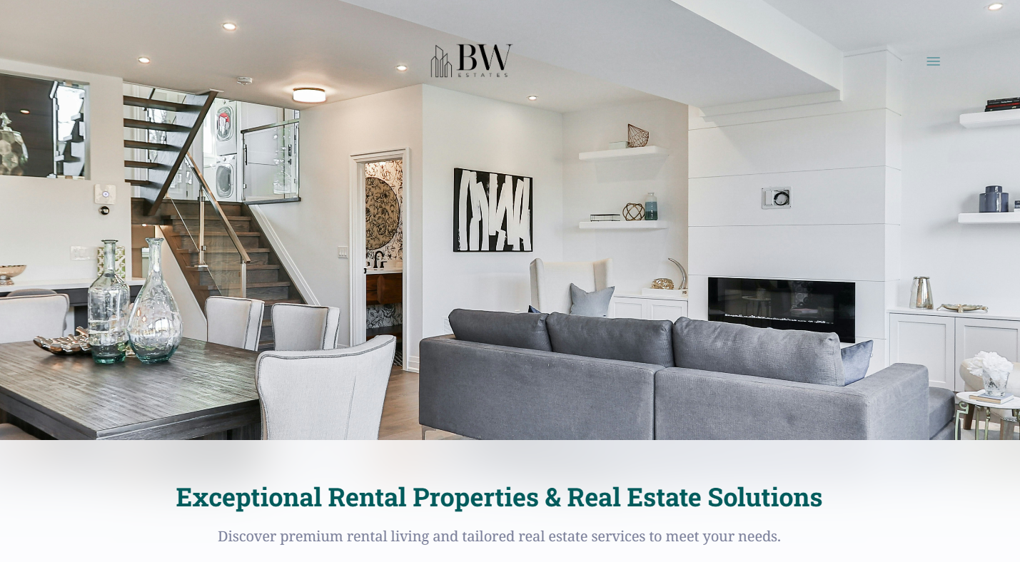
Elevating the Brand’s First Impression
A polished logo is often the first point of connection for clients, and BW Estates’ new mark sets a tone of reliability and sophistication. With its minimal lines and balanced structure, the logo positions the brand as both modern and dependable — supporting every future touchpoint across the company’s identity.
Results of the project
Timeless Visual Concept
Designed a logo grounded in simplicity and balance, creating an identity that will remain relevant and professional for years to come.
Versatile Branding System
Delivered multiple logo formats and variations for use across website, signage, business cards, and promotional materials.
Geometric & Symbolic Structure
Incorporated subtle architectural and real-estate cues into the shapes and proportions, reinforcing the brand’s industry without being literal.
Clear Brand Consistency
Defined spacing, proportions, and color usage to ensure the logo maintains its integrity across all applications.